Star Gazer
Hobby Gamer
Mythophile
Animes
Dosas & Biriyanis
Millenial
Star Gazer
Hobby Gamer
Mythophile
Animes
Dosas & Biriyanis
Millenial
Star Gazer
Hobby Gamer
Mythophile
Animes
Dosas & Biriyanis
Millenial
Contact MeContact Me
ZetaPay UPI App
Designing a fast, trustworthy and error-proof payment experience
UPI app designed around user anxiety - what do they need to know before making a payment and when one fails? Every screen answers that question.
Role:
Product Designer (UI & UX)
Scope:
UI, UX - Research, Competitive Analysis, UX Writing, Interaction Design, Visual Design
Image: ZetaPay UPI App
Image: ZetaPay UPI App mockups
Problem & Design Challenge
PROBLEM
UPI apps handle the happy path well. But when something goes wrong users are left without answers.
PAIN POINTS:
Payment failures with no explanation of what went wrong.
Anxiety during processing "Did it go through?"
No visibility into which stage of the payment pipeline failed.
DESIGN CHALLENGE
How might I design a payment experience where users feel confident initiating, informed during processing and in control when things fail without adding complexity to the core flow?
Success Criteria & Constraints
SUCCESS CRITERIA
The design would be successful if users could:
Know their balance at the point of payment not a screen away.
Understand exactly what failed and what to do next.
Support multi-bank accounts with seamless pre-payment account switching.
CONSTRAINTS
No live transaction data (concept project); outcomes are projected.
UPI failures are often outside the app's control; design must communicate this without eroding trust.
Designing for both first-time users and daily power users in the same flow.
Financial UI trust is fragile every microcopy and color decision carries weight.
Strategy
STRATEGY
Transparency over abstraction
Surface the payment pipeline in plain language, especially on failure.
Persistent balance visibility
Balance follows the user into the payment confirmation screen. No context switching.
Pre-payment account control
Users choose which account to debit before the bank is contacted.
Error states as guidance
Every failure answers three questions: What failed? Why? What do I do now?
Key Decisions
KEY DECISIONS
Collapsible Balance & Account Card - Home Screen
Why: Showing full account details by default clutters the home screen for most sessions.

What I did: Toggle balance visibility. A drag handle expands the card to reveal linked accounts as selectable cards with the active account highlighted in green.

Outcome: Clean home screen by default. Account switching accessible without leaving the home view.
Image: Collapsible Balance & Account Card
Image: Regular Payments
Regular Payments Section
Why: Daily users and small business owners repeat the same payments constantly like  insurance, subscriptions, vendor payments, rent etc.

What I did: A user-defined grid of recurring payees,. businesses and contacts surfaced directly on the home screen. Manageable via a "Manage" shortcut.

Outcome: Quicker findability and fewer taps to the most frequent payment scenarios.
Conversational Transaction UI & Split Bill
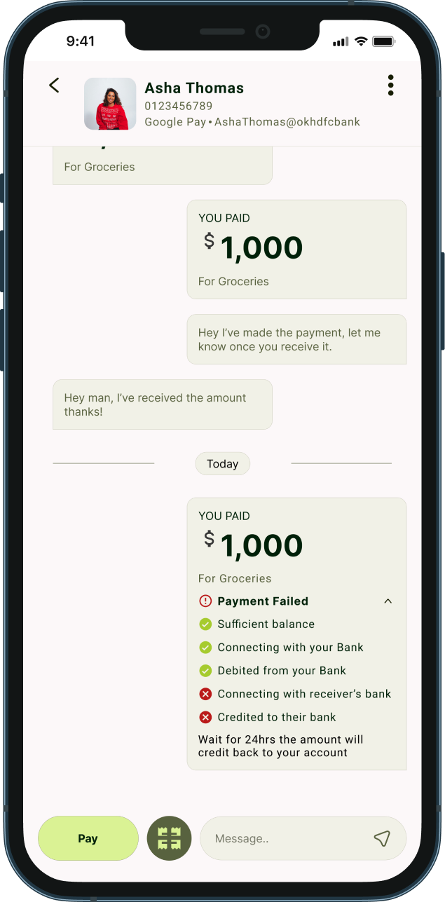
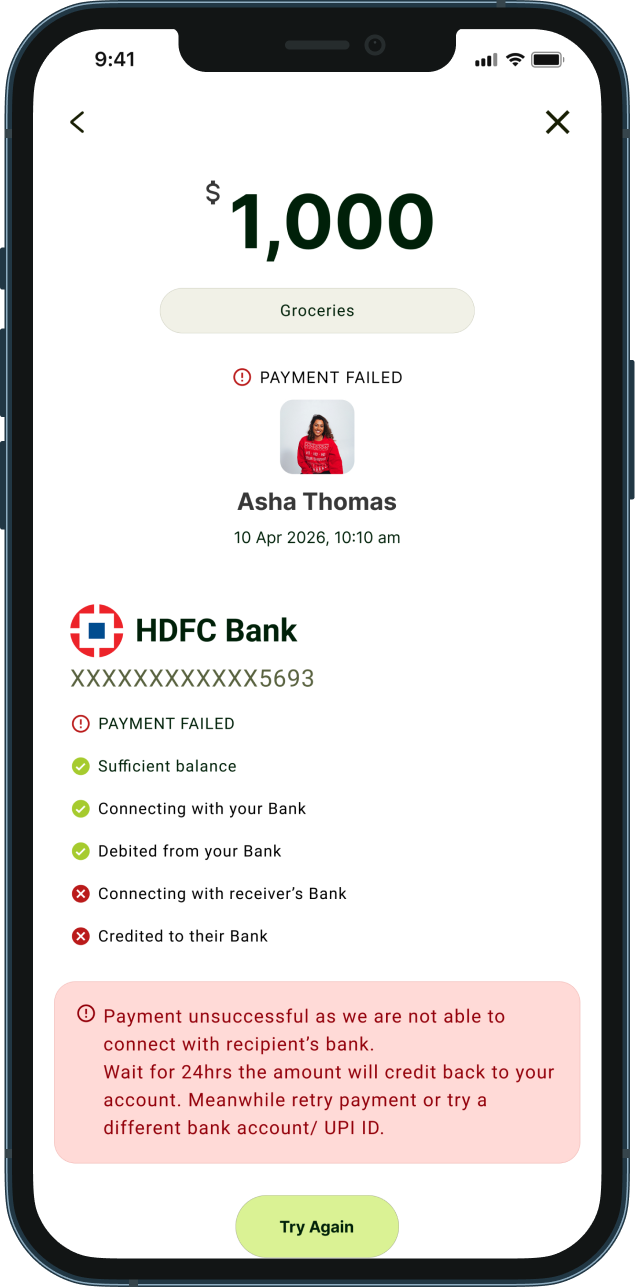
Why: Ledger-style history is cold; hard to scan, and the payment failure statuses are vague. Manual bill splitting causes context switching and calculation errors.

What I did: Retained transaction history between users displayed as chat bubbles, same as Google Pay/PhonePe (Jakob's law), made the payment pipeline breakdown for failures to provide more visibility on the user's money and build trust. Split Bill icon in the bottom bar auto-calculates per-person share from total amount and headcount, very useful in group settings and reduces "how much do I owe you?" ambiguity.

Outcome: Experience relevance to other popular apps. Bill splits are instant and error-free.
Image: Transaction UI & Split Bill
Image: Balance & Account Selector
Balance & Account Selector at Payment Confirmation
Why: Users discover insufficient balance only after a payment fails. Multi-account users had no way to choose which account to debit mid-flow.Complex navigation increases anxiety and confusion.

What I did: Balance shown as a persistent pill above the account selector on the confirmation screen. Full recipient identity displayed prominently. Swipe-to-pay prevents accidental confirmation.

Outcome: Users verify balance, recipient and payment account in one screen before the bank is contacted.
Payment Pipeline Breakdown on Failure
Why: Generic "Payment Failed" messages cause panic, repeated blind retries and unnecessary support contacts.

What I did: Failure screen shows a step-by-step pipeline so users see exactly where it broke. Plain-language explanation of the failure reason. Refund timeline communicated upfront. Options: Retry, switch UPI ID, or Contact Support. Share button for receipt.

Outcome: Users know their money is accounted for. Failure becomes informative and not alarming.
Image: Payment Failure Breakdown
System Improvements
SYSTEM IMPROVEMENTS
Balance visible at both home and payment confirmation never out of context at a decision point.
Pre-payment account switching before bank contact reduces failures from wrong default account.
Payment pipeline established as a reusable transparency pattern across all transaction states.
Swipe-to-pay as a deliberate trust mechanism not a friction problem but a safety feature.
Regular Payments grid scales from personal use to small business payment patterns.
Trade - Offs
TRADE-OFFS
Transparency vs Simplicity on Failure Screen
The pipeline breakdown adds visual weight to an already tense screen. Chosen deliberately a user who knows where their money stopped is far less anxious than one who sees a generic error.
Balance Visibility vs Privacy
A quick-mask toggle to balance even on the confirmation screen eliminating transaction anxiety.
Collapsible Card vs Discoverability
First-time users may not know the home screen card is expandable, avoids clutter. The drag handle provides a cue.
Swipe to Pay vs Speed
Adds half a second for power users. Justified for the safety and trust it provides on every transaction especially high-value ones.
Impact
IMPACT
Users now feel more confident making payment decisions and aware what to do next when the payment fails making daily transactions hasle free and anxious free.
User Impact
Reduced payment anxiety through pipeline transparency on failure.
Fewer accidental payments via swipe-to-pay gate.
Faster recurring payments via Regular Payments shortcuts.
Zero manual calculation errors in bill splits.
Product Impact
Lower "where's my refund?" support volume addressed directly in the failure screen.
Higher retry rates post-failure, informed users retry; confused users abandon.
Stronger trust perception for multi-bank account users.
The experience shifts from anxious transaction to an informed outcome.
Key Learnings & Next Opportunities
KEY LEARNINGS
Error states are trust moments, not edge cases - how the failures are handled defines user's confidence in the product.
Intentional friction belongs in financial UX - swipe-to-pay is slower by design.
Balance and recipient visibility at the point of decision is non-negotiable.
Designing for failure is designing for trust.
NEXT OPPORTUNITIES
Smart account recommendation based on available balance.
Pending state animation during live processing, addresses anxiety in real-time, not just post-failure.
Conduct additional usability studies with broader demographics.