Star Gazer
Hobby Gamer
Mythophile
Animes
Dosas & Biriyanis
Millenial
Star Gazer
Hobby Gamer
Mythophile
Animes
Dosas & Biriyanis
Millenial
Star Gazer
Hobby Gamer
Mythophile
Animes
Dosas & Biriyanis
Millenial
Contact MeContact Me
DI.RE.CT (Disaster Response and Control)
Designing a fast, accessible and trustworthy emergency response app for India
Designed for the Worst Moment of Someone's Life. In emergencies, clarity isn't a design preference it's a survival requirement. DI.RE.CT strips away everything that doesn't help a panicked user get help, find family or reach safety in seconds.
Role:
Product Designer (UI & UX)
Scope:
UI, UX, Mobile app, Interaction design, UX Writing, Accessibility
Image: DI.RE.CT (Disaster Response & Control) App
Image: DI.RE.CT (Disaster Response & Control) App Mockups
Problem & Design Challenge
PROBLEM
During disasters, people panic. The apps and systems meant to help them add to the confusion instead of cutting through it.
PAIN POINTS:
The Govt. platforms/websites are cluttered with too many information, tabs, buttons, hidden links and not mobile friendly.
No dedicated apps to help users reach for help, as the website traffic increases during emergencies and are also unreachable due to poor network.
No single place to call for help, report a disaster and locate shelters.
Emergency contacts are either outdated or buried behind multiple taps when seconds matter.
Language barriers leaving non-English speakers without critical information.
No way to distinguish between a rescuer and a civilian in the same system slowing coordinated response.
No real-time awareness of what disaster is occurring, where, how severe and precautions to take, all in one place.
DESIGN CHALLENGE
How might I design an emergency response app that gives a panicked user the right action in under 3 seconds while simultaneously enabling rescuers and volunteers to coordinate faster and more effectively?
Success Criteria & Constraints
SUCCESS CRITERIA
GENERAL PUBLIC
Critical actions - ambulance, SOS, disaster report are reachable in one tap from the home screen.
Emergency contacts accessible and callable without navigating away.
Location shared automatically to family and rescue teams on SOS trigger.
Disaster severity and safety guidance readable without prior knowledge of the app.
RESCUERS/VOLUNTEERS
SOS alerts surfaced with distance and one-tap call and track.
Clear separation from general public UI to avoid role confusion.
Govt. ID verification at onboarding to prevent impersonation.
CONSTRAINTS
Concept project - outcomes are projected, not measured from live data.
Designed for India's diverse user base: varied digital literacy, multiple regional languages, elderly users.
Network reliability during disasters is unpredictable core actions must be minimal in data dependency.
Trust and impersonation risk - rescuer role requires verification without creating a barrier for legitimate responders.
Emotional state of users is extreme - every extra tap, every unclear label, every missing guidance costs real time in a real emergency
Strategy
STRATEGY
Emergency-first information architecture
The most critical actions own the entire home screen. Nothing competes with them.
Role segregation from onboarding
General public and rescuers get fundamentally different experiences from the moment they register. One system, two purposeful interfaces.
Language before everything
Multi-language selection is the first onboarding step, with a translate shortcut available even on the pre-login screen. No user reaches a critical moment in a language they don't understand.
Trust through verification
Rescuers upload Govt. ID during onboarding. Family contact data is masked by default behind a password. Both decisions signal that the app takes user safety and data privacy seriously.
Severity as a visual language
Red, amber and grey communicate disaster severity across the map instantly - no reading required to understand urgency.
Key Decisions
KEY DECISIONS
Pre-Login Translate & Phone Number Login
Why: Email-based login creates friction for elderly and low-literacy users. Non-English speakers reaching a login screen in the wrong language may abandon before registering.

What I did: Login reduced to phone number only - no email, no password at entry. A Translate button is visible on the login screen itself, before the user has even registered, ensuring language is never a barrier to accessing the app.

Outcome: Lowest possible entry friction. Language accessibility starts before onboarding, not after.
Image: Prelogin Translate & Easy Login
Image: Onboarding Screen (Language Selection)
Language Selection as Step 1 of Onboarding
Why: India has 22 scheduled languages. An emergency app that only works in English excludes a majority of its most vulnerable users.

What I did: Language selection - English, Gujarati, Hindi, Kannada, Malayalam, Tamil, Telugu is the first onboarding screen. All subsequent onboarding and app content renders in the selected language. The Translate button persists throughout onboarding as a fallback.

Outcome: Every user completes onboarding and uses the app in their preferred language. Reduces comprehension errors during high-stress registration.
Role Segregation: General Public vs. Rescuer/Volunteer
Why: A single undifferentiated interface forces rescuers to navigate a civilian-facing app to do their job and risks civilians accessing rescue-coordination tools incorrectly.

What I did: Step 2 of onboarding asks users to identify as "General Public" or "Rescuer/Volunteer." Rescuers are required to upload a Government ID and select their service type (CRPF, Army, Paramedic, etc.). The two roles unlock distinct navigation - the Rescuer nav includes an Alerts tab absent from the general public view.

Outcome: Role-appropriate interfaces for both users. Verified rescuer credentials reduce impersonation risk. Alerts screen visible only to those who need it.
Image: Onboarding Screen (Role Segregation)
Image: Home Screen
Emergency-First Home Screen
Why: In a panic, users cannot navigate a feature-rich home screen. The most critical action must be impossible to miss.

What I did: The entire home screen for General Public users is dominated by two full-height tiles - blue for "Book Ambulance Service" and red for "Emergency, Fire Calls & SOS" with high-contrast icons and all-caps labels. A "Tap to Report Disaster" button sits persistently at the bottom center. Post-SOS, a snackbar confirms your SOS call.

Outcome: Zero navigation required for the three most critical emergency actions. Post-SOS confirmation reduces the "did it go through?" anxiety identified in the problem statement.
Mandatory Emergency Contact at Onboarding
Why: Users in emergencies often can't recall contact details under stress. Family members need to be findable without the user having to type anything mid-crisis.

What I did: Onboarding requires at minimum one emergency contact - photo, name, relation, mobile number, email with an option to add more.

Outcome: Emergency contacts are always ready.
Image: Onboarding Screen (Family Member/Emergency Contact)
Image: Disaster Severity on Map
Tiered Severity Map with Contextual Dos & Don'ts
Why: Knowing a disaster exists is not enough - users need to know how serious it is and what to do right now.

What I did: The map uses color-coded markers: red for High Alert, amber/orange for Medium Alert and grey for Low Alert. Each representing a different disaster type with a distinct icon. Tapping any marker opens a contextual info card showing the disaster type, affected location, severity description and a scrollable Dos and Don'ts list specific to that hazard. The map also has filter chips for Weather, Hospitals & Shelters, and (for rescuers) Alerts/SOS.

Outcome: Severity is scannable at a glance without reading. Actionable guidance is one tap away from any alert marker reducing panic and increasing informed response.
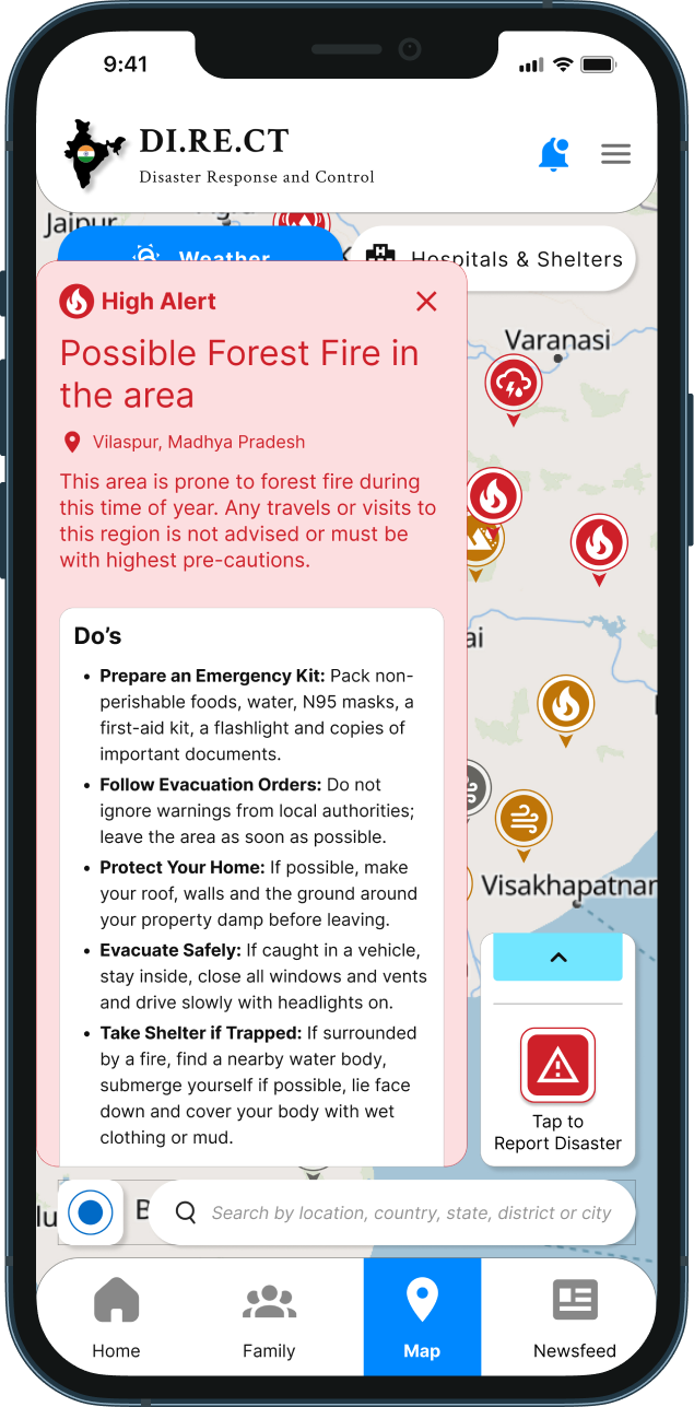
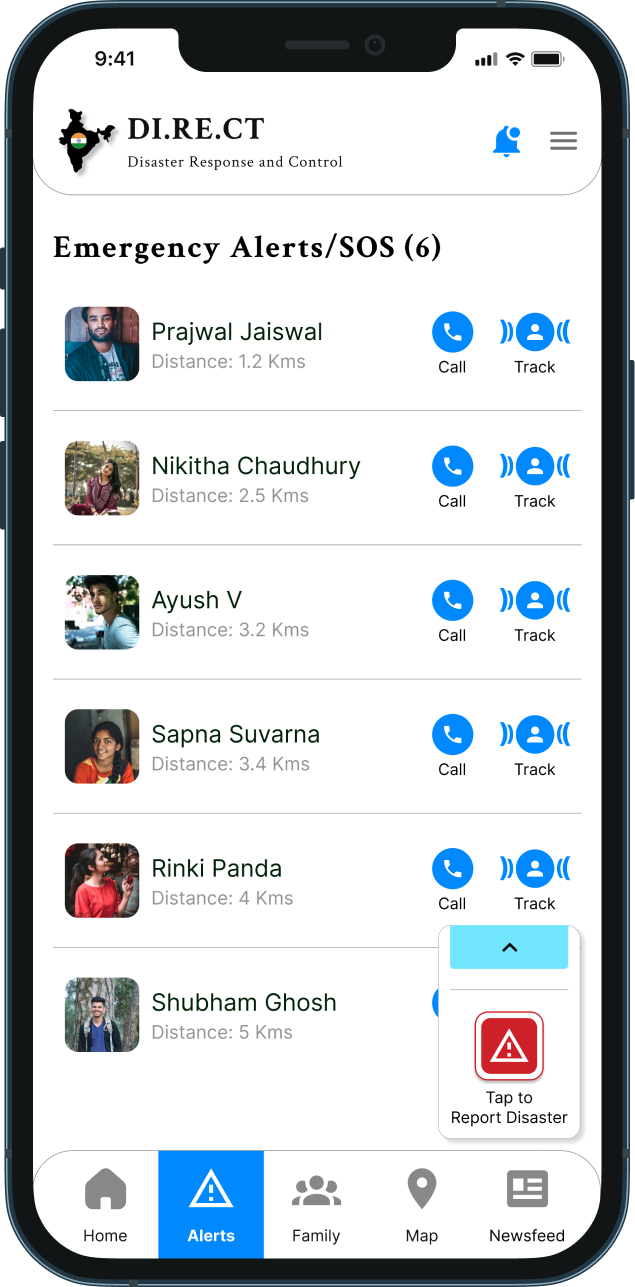
Rescuer Alerts Screen with Distance & One-Tap Response
Why: Rescuers receiving SOS alerts need to know who needs help, how far they are, and be able to act immediately without switching between apps or making multiple taps.

What I did: The Alerts screen exclusive to Rescuer/Volunteer users lists all active SOS requests with the person's photo, name, and their distance from the rescuer's current location. Each entry has a one-tap "Call" and "Track" action, allowing immediate voice contact or live location tracking in-app.

Outcome: Rescuers go from alert to action in two taps. Distance information enables smarter, faster resource allocation during multi-incident scenarios.
Image: Rescue Alert Screen
Image: Family Members Screen
Family Screen with One-Tap Call and Location Share; Password-Protected Family Details
Why: During an emergency, finding and contacting family should take zero thinking. But contact data also needs to be private - a shared or stolen device should not expose family information.

What I did: The Family screen lists all emergency contacts with photo visible, names/relations masked by default. Each contact has a one-tap "Call" button and a "Share Location" button sending the user's live location directly to that contact. A separate onboarding step sets a password specifically to mask family member names and relations on the Family screen. Contact photos remain visible; identity details are blurred until the user authenticates.

Outcome: Family communication reduced to one tap. Privacy protected without sacrificing speed of access.
System Improvements
SYSTEM IMPROVEMENTS
Role-based navigation system: Rescuers have a distinct nav bar with Alerts tab; general public nav is streamlined to Home, Family, Map, Newsfeed.
Language system activated before login: accessibility begins before the first authenticated screen.
Severity color system (Red/Amber/Grey): established as a reusable visual language across map markers, alert cards and future notification states.
Emergency action persistence: "Tap to Report Disaster" CTA floats consistently across all screens ensuring critical action is never more than one tap away regardless of current screen.
Privacy-by-default pattern: family contact data masked at rest, revealed only on authenticated action.
Verification gate for sensitive roles: Govt. ID upload for rescuers creates a trust layer without blocking legitimate users.
Trade - Offs
TRADE-OFFS
Simplicity vs Feature Depth
The home screen is intentionally limited to three actions. Features like alerts, map, family, news are in the nav bar. This means feature discoverability is lower.
Role Self-Selection vs Verification Delay
Rescuers must upload a Govt. ID before accessing their full interface. This creates a registration delay for legitimate responders. However, an unverified rescuer role poses a greater safety risk than a brief onboarding friction.
Password-Protected Contacts vs Emergency Speed
Masking family member names behind a password adds one authentication step to the Family screen. In a genuine emergency, this is friction. The design mitigates this by keeping photos visible and Call/Share actions accessible without unmasking the password only reveals the text identity, not the action buttons.
Map Marker Density vs Readability
The map shows many simultaneous markers across India. In high-density disaster zones, markers can overlap and become hard to tap individually. Cluster grouping or zoom-based filtering would be needed in a production version.
Newsfeed Content vs Distraction
The newsfeed screen keeps the emergency specific contents allowing users to retain their attention on an emergency action during an active crisis without any distractions caused by active alerts and notifications.
Impact
IMPACT
Users can now make quick and informed decisions during distress without having to experience cognitive load even in panic and anxious situations.
User Impact
Faster time to emergency action through single screen.
Reduced panic post SOS through immediate confirmation snackbar.
Zero language barrier at any stage from pre-login through active use.
Rescuers reach affected users faster through distance based alert prioritization and one tap response.
System Impact
Lower miscommunication between general public and rescue teams through verified role segregation.
Reduced support burden through self-explanatory severity indicators and in-context Dos & Don'ts.
Stronger user trust through privacy-by-default family contact masking and Govt. ID verification.
The experience shifts from panic and ambiguity filled actions to intentional and faster decisions.
Key Learnings & Next Opportunities
KEY LEARNINGS
In emergency UX, every additional tap is a design failure - the home screen must be the answer, not the starting point.
Role clarity is a safety feature, not just a UX preference. One system serving two fundamentally different user types needs explicit, verified separation.
Accessibility in India means language-first, always an app that works only in English is an app that fails its most vulnerable users.
Trust is built through both design and system - password-masked contacts and ID-verified rescuers communicate that the app takes user safety seriously beyond just visual design.
Contextual guidance at the point of crisis - Dos & Don'ts surfaced on the map marker, not buried in a help section is the difference between information and action.
NEXT OPPORTUNITIES
Offline mode: core emergency actions (SOS, stored contacts, cached map data) must function under poor or no network conditions, the most common scenario during actual disasters.
Cluster grouping on map: handle marker density in high-alert zones without sacrificing readability.
Active crisis mode: when an SOS is live, the entire app UI shifts to crisis state: newsfeed suppressed, family contacts surface, map centers on user location.
Push notification system for rescuers: alert them to new SOS requests even when the app is backgrounded.
Accessibility expansion: Screen-reader compatibility and voice-guided navigation.